Instead of ranting and raving about the issues and which man is right for the job, I’m going to make my determination like any good techie would…by his Website of course! So without further ado, I will attempt to take an unbiased look at these two fine gentlemen’s Websites and may the best Website win!
I will rate them on five different categories, all having to do with aesthetics, usability and their ability to get their message across.
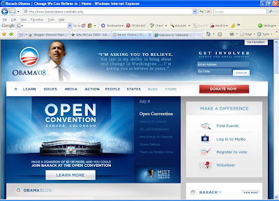
I’ve added snapshots of both of their Home pages below for clarification.
The first category is color pollution. This is the ability to use a few (less than three) primary colors to make your Website attractive and vibrant without overdoing it and giving your eyes too many things to look at. The last thing you want to do is take away from the most important thing on a Website: the content!
this one has to go to Obama. He does a nice job of using blue as his main color of choice with some splashes of red against a white background. Very nice and elegant.
McCain, on the other hand, has green, blue, yellow, red and white and the site just really looks busy.
So the first victory goes to Obama!
In my next post, we will tackle links and key info above the fold. Stay tuned!
your friend,
Corey Perlman
http://www.theebootcamp.com/
